Mike Jordan
Another topic for discussion!
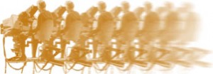
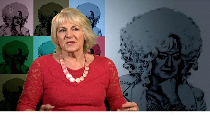
I finally got round to watching the Paul O’Grady documentary (first transmitted 14th June 2017), I noticed that all the interviews with various backgrounds had a yellow fringe and sometimes on one guy, quite a lot of yellow overspill on his jacket. However the keying on blonde hair seemed to work very well.
I didn’t know one ever used Yellow CSO and I would guess it wasn’t a lens ring system (I may be wrong). However the yellow margin really showed up badly.
The attached frame grab tried to show it but doesn’t work very well.
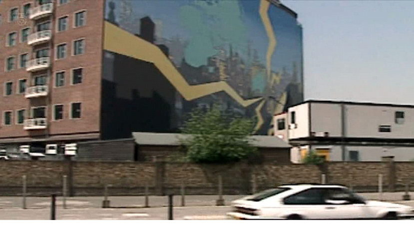
Whilst I was at it, I grabbed a frame with the huge mural on the end of stage 5 which also appeared briefly.
(Click on the pictures below to see a larger or clearer version of the picture:
Click the “X” button (top right) to close the newly opened picture.)
Graeme Wall
Yellow CSO was used regularly on “Dr Who” because of the TARDIS. I spent one series (Jon Pertwee) dashing backwards and forwards between the control room and the apparatus room in TC6 swapping the modules over as there wasn’t a switchable version. The reason for the continual swapping was that anything involving the TARDIS had to be yellow but the Doctor’s assistant, Katy Manning, was a blonde in a yellow dress with gold make-up! Hence we then had to use blue. The inevitable moment came when she had to walk out of the TARDIS…
Chris Woolf
It’s always been possible to use yellow (which is effectively negative blue), and the earliest CSO desks allowed for the possibility, since the “knob” had the full range on the blue axis.
I can remember using a yellow lit cyc as a key background with Stan Dorfman (?Bobby Gentry), though it was never planned that way. Stan used to accept anything that looked fun on the day – I even used colour bars as a fill on dancers in wide shot on one occasion, and didn’t get bollocked for it.
The Beeb used some rather phoney arguments for what the key colour should be – based on the theory that blue had the lowest luminance value and didn’t occur much in flesh tones. That suited the planning system for lighting and scenery, but actually, being able to select the colour axis makes much more sense. Hence the common use of green nowadays. On the slow switch edges that early systems used (and before soft-edge “mix” switching became possible), blue fringes frequently looked very aggressive, and yellow could be far more acceptable.
Ian Hillson
CSO was obviously a gradual improvement – we started off with a blue (a B-Y) key and then moved on to yellow as that just involved a key inversion without any more matrixing. By the time we got to a switchable 6 position module other refinements had been incorporated such as B-m where ‘m’ is the unweighted Y signal (helped separate blue and magenta for a better B-Y switch, for instance).
Also incorporated was ‘hue suppression’ as RGB direct from each camera went through the box, allowing the keying colour to be suppressed down to the level of larger of the other two colouring channels (or smaller, if you were using Cyan, Magenta or Yellow). Hue suppression is not talked about much in BBC circles, as I suspect the technique infringed an Ultimatte patent.
Certainly I never saw any of the BBC 6-axis boxes appear subsequently on the open surplus market.
Roger Bunce
Yes, before they discovered how well Green worked, Yellow was the common alternative to Blue. Yellow was often used on “Dr. Who” because of the blue Tardis, and on “Z-Cars” (after they’d given up on Back Projection) because of the blue police uniforms. Yellow fringes tend to be larger than blue fringes, because there is a lot more yellow in human faces, so keying cannot be so tight.
I particularly remember (he lied – but my memory has been reinforced by some research!) using Yellow CSO on Tom Baker’s first adventure as the Doctor – ‘Robot’. Barry Letts was fed up with blue fringes, so he decided to use yellow. He was unaware that, by this point, Dave Jervis had developed a system of suppressing blue fringes. This primarily consisted of removing all the blue content from the foreground image (after cutting out, but before pasting onto the background). The blue fringes now became dark grey, and virtually invisible, while, because there is very little blue in human flesh tones, the faces remained largely unchanged. Unfortunately, the same technique, applied to yellow fringes, was less successful. Because yellow has a higher luminance value than blue, removing yellow from yellow fringing creates very bright, almost white, fringes – which are glaringly obvious. And removing the yellow content from human flesh tones turns them purple, as though the faces are being strangled! The other problem was that the robot was metallic silver and, therefore, reflected the colour of the overlay background, causing bits of it to disappear. A gold robot, in front of a blue cyc, would have worked well.
If you’re reading this Dave Jervis, and I’ve got my facts wrong, please let me know!
Mike Jordan
This guy has some well worth watching videos! Browse some more.
Bernie Newnham
That’s very good, apart from the line about Paintbox, which only did stills.
Roger Bunce
He considers 1980 to be early?
Youngster!