Bernie Newnham
“The Big Short” deserves its Oscar nomination, but it’s let down somewhat by the camerawork. It’s shot fly on the wall style, though obviously it isn’t, with lots of BCUs, and far too many shots are out of focus – not much, just that tiny bit that makes it really irritating. Gives me right hand finger twitch, a nervous reaction now 39 years out of date.
I’ve made a few real fly on the wall documentaries, and I soon learned that a finger resting on the Push Auto button can save an awful lot of angst. Does anyone know if Arri Alexas (or whatever) have push auto buttons?
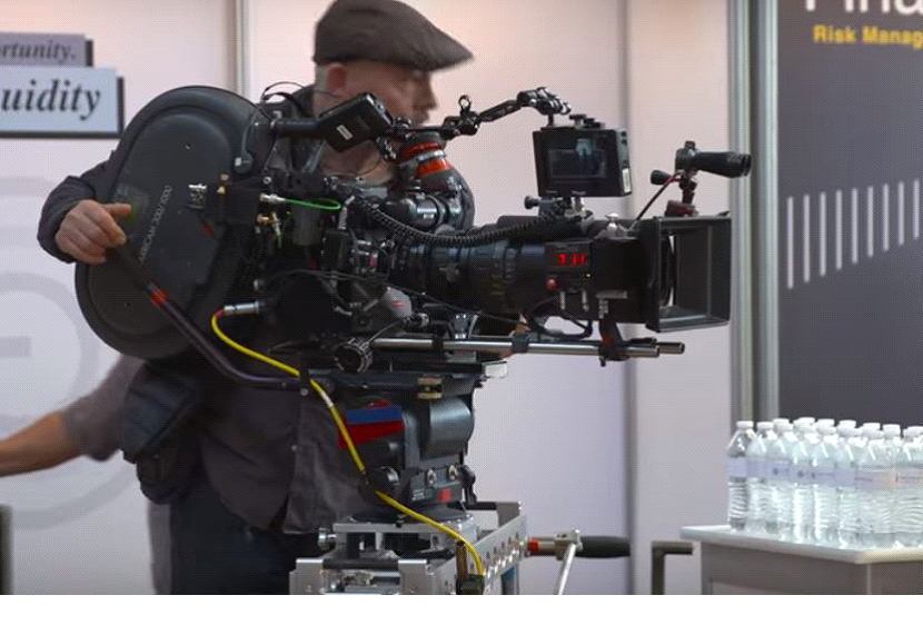
This is what “The Big Short” was shot on. It’s obviously too posh to have a Push Auto button, to its loss.
(Click on the picture below to see a larger or clearer version of this picture:
Click the “X” button (top right) to close the newly opened picture.)

Pat Heigham
‘Arricam’ on the magazine is a bit of a give-away! It’s 35mm real celluloid (hooray) but with the facility of a video tap for external screens. It amazes me that so many of these devices, and the electronic ones, too, need so much stuff hung on as extra – electronic screens, timecode lockit boxes, remote control focus etc. and radio mic receivers for audio on the digital beasts! One would think that a lot of today’s machines would have much of this manufactured in, but I suppose there are all too many variable requirements.
Now, whilst viewers might be orgasmic over the “War and Peace” dramatization on BBC1 (Jan 2016) – I, as a feature film technician wish to object to the hand-held wobblyscope camerawork. Why is it necessary? Answer: because it’s cheap!
It takes time to set up a shot with the camera on legs (a tripod) and getting the artistes to hit their marks for a good composition. And time is money. But the bigger the screen, the worse it looks, as movement of the frame is magnified. It could be excused on documentary filming, but not on an expensive drama production.
It’s all the more noticeable with cuts to wide and exterior shots which have been properly set up with the camera securely mounted. Handheld material can be very acceptable with Steadicam. Today’s cameras are unwieldy for hand use, due to various attachments – monitors, battery packs, timecode sync control boxes, making the rig somewhat heavy and unsuitable for shoulder mount.
Dave Plowman, Graeme Wall
There’s more to it than that. A director explained it thus to me:- “…Your eyes ain’t on a tripod. Your head moves ever so slightly at all times. A small amount of random movement on the camera sets out to replicate this…” Which is nonsense, of course, because the brain processes the image to remove the movement.
Another thing that director said – and he was no newbie straight out of college, but a very experienced and well known one – was that anything technique-wise which grabbed the attention of a casual viewer was probably wrong. Different matter if you set out to analyse a style.
Pat Heigham
Yes, the head and eyes do move. But, the image on a screen is what is intended to be presentedto the viewer. On a large screen, the viewer’s eyes are flicking around, even on a smaller TV screen field of view. We don’t need a double set of movement which the ‘random’ movement engenders.This Director is talking rubbish.
I can appreciate a handheld camera neatly and smoothly adjusting the framing to make a good composition, like it might be a dolly track, but deliberate ‘random’ movement is just irritating.
It’s most noticeable on some of the Portillo Train interviews. Maybe this director thinks that the camera is actually an onlooker and shifting from foot to foot. Maybe we would if we were actually there, but we aren’t!
And, considering a large 30′ screen (feature) presentation, I repeat – unnecessary frame movement just is unacceptable.
John Henshall
Spot on. I was going to say exactly the same that the director (note small ‘d’ – he doesn’t deserve a big one and probably only has a little one anyway) is talking total crap. Like others, he clearly just believes it’s the fashion.
As for news … I can no longer bear to watch it on the BBC. I do not need to be reminded at the start of every bulletin that they have five cameras in the studio – four of them choreographed in shot. Other programmes don’t feature cameras in shot. As for the aimless zoom across to the weatherperson, invariably cut away from in mid zoom, and the awful heavy drumbeats to emphasise even the most trivial … Fortunately other news channels are available. And I don’t want to be constantly reminded of the £2billion of OUR (license payers’) money the move to W1 cost.
When I heard that the BBC was to foot the bill for over 75’s licenses, my immediate thought was to continue buying a licence. But now I can’t wait to reach 75 so that I can avoid subsidising expensive managers who have never been involved in programme making in any way.
Gary Critcher
I absolutely hate wibbly-wobbly TV with a vengeance.
It’s so un-called for, looks awful, and usually detracts from the story being told on screen.
Dave Plowman
I’d call it more a point of view. I’ve been on lots of drama shoots where this movement was intentional and nothing to do with saving time, etc.
If you’re going to talk about things having to be how the brain decodes them, how do you justify using a long lens to soften the background? The eye and brain don’t do this.
Geoff Fletcher
One thing that drives me crazy is when the automatic cameras on news/ current affair progs are crabbed around on wide shots for no good purpose. If the shot is wide then the angle doesn’t alter enough to make it worthwhile, and anyway – why do it? We didn’t do it way back with our manned cameras – the wide shot was generally used as the safety cutaway to enable the close up cameras on left and right of set to switch to an MCU of the relevant speaker as required. It was kept static as far as I recall. Or am I just out of date with my way of thinking? Anyone else share my opinion?
Graeme Wall
It’s a habit on sports programmes as well, the wide shot camera wandering around for no good reason.
Tony Nuttall
I refer to such operations as the dill-do camera. No motivation. No attempt to improve the eye line etc. etc.
The shot that really gets my goat in the new ear’ole shot, often seen on the interviews on ITN although many others are equally responsible. May be they could be listed as the big ear’ole, medium ear’ole and long ear’ole?
Roger Bunce
Amongst the many things that annoy me about BBC News –
1: That vast, empty, soulless newsroom/atrium is bloody ugly. Any wide shot reminds me of the billions that were wasted building it, when they could have stayed in the more aesthetically pleasing TV Centre, for free. They can’t even get a designer in to revamp it occasionally, since it’s architecture, not scenery.
2: Because the moving shots are robotic, it’s always exactly the same move. There’s no artistic variation. First time I saw that swoop from Newsreader to Weather Person, I thought it was spectacular. Second time, I thought, I’ve seen it before, couldn’t we try something different? (Deep 2S, throw focus onto Weather Person? Frontal Newsreader, crab round to reveal Weather Person in b/g? etc.) Third time, I thought, I’m bored now. Since then I’ve thought, just cut! You could fit in another news item if you cut that wretched swoop!
Nick Ware
Rumour has it that because the robotic BBC News studio camera setup wasn’t designed by the people who use it, the tracks were placed too close. No-one had thought to allow space for the Autocue hoods. The first time they tried to use them they bashed into each other, and had to be programmed to pan 90 degrees whenever they passed behind the one in front, or in front of the one behind. It would have been great to have witnessed that epic-fail moment!
Dave Buckley
There have been discussions on the quality of news sound and also on the automated cameras.
I put the following points to my nephew who works for news and directs the 24 hour news channel, world news and, so far as I know, the 6pm and 10pm bulletins:
(1) Sophie Raworth sounding as if she had several winter duvets on
(2) Are some of the mics simply worn out. Is there EQ fitted to the mixing desks in use these days? and (3) No-one had thought to allow space for the Autocue hoods,
Here is his reply…
“…I’ll pass those comments onto the head of sound. But I agree, it’s rubbish. All the mics are knackered ECMs, and very few people care anymore. Morale here is rock bottom, and quite astonishingly most people who sit on sound have no idea how to even access the EQ panel. Sigh.
I can’t comment on the specifics of points 1 or 2, but on number 3, the tracks are fine. The use of rails is no different to other studios at other broadcasters who use robot cameras that move about looking at barcodes on the ceilings. In the last year directing on the News Channel and on WorldNews, both who use track cams, I’ve never had a problem. In fact, for news, they’re perfect, and work best when left to be controlled by the automation. Problem with sound and cams generally happen when people try to override or fiddle…”
I’ll be interested to see (or perhaps, hear) if there’s any improvement! Also, I’m wondering if the head of sound (whoever that is nowadays and would that be for News?) will contact me for more information.
Peter Cook. Mike Jordan, John Howell
And why do all newsrooms have mirrored tables? Because under that table are the monitors for certain newsreaders to KEEP looking down at and also I assume computer screens with latest information and, since studios are now all whizzy, possibly a studio out monitor! and Autocue in case the cameras have got bored and whizzed off somewhere else?
Alasdair Lawrance
Another particular bȇte noire is a two-shot interview with a slow crab in either direction. Usually seen on “Newsnight”, the Andrew Marr programme on Sundays and the like. Once had it explained to me as “…mimics 3-D TV….” also, of course, technically known as ‘bo**ocks’.


